Link to website:
https://securis360.com/


SECURIS360
Website Redesign
The Team
Khushali Parekh
Client
Securis360
My Role
Branding
Wireframing
Website Redesign
Prototyping
User Testing
Project Duration
2 months
March 2024-May 2024
Tools Used
Figma
Adobe Illustrator
Miro
CHALLENGE
The primary challenge of this project was redesigning the Securis360 cloud security platform to better serve security professionals while preserving its robust functionality. The existing interface suffered from cluttered navigation, inconsistent visual hierarchy, and dense technical information that made it difficult for users to quickly identify and respond to security threats.
RESULTS
I needed to transform this complex system into an intuitive interface. The website redesign improved user flow, reducing bounce rates, increasing time-on-site, while also making it easier to showcase Securis360’s services like global compliance, Third Party Risk, GDPR, and Policy Review. The new brand identity enhanced brand recognition and created a cohesive presence across all materials.
Increase in time-on-site
30%
Increase in leads from the website
30%
Reduce in bounce rates
20%

THE PROBLEM: HEURISTIC EVALUATION
While digging into the usability issues, I wanted to shift my thinking from "what's wrong" to "what could be better." I used How Might We (HMW) statements to help me reframe these problems as opportunities for innovation. This approach helped me stay focused on the security professionals who would actually use this platform every day.
Too much time spent on finding the right tools
How might we simplify the navigation structure to help security professionals quickly access the tools they need?
Lot of dense, technical language used
How might we simplify content about services offered so users can understand capabilities at a glance?
Similar visual weight across elements obscured priorities

How might we enhance visual hierarchy to guide users' attention to the most critical information?
THE SOLUTION
After thoroughly analysing the usability issues and identifying key opportunity areas, I developed a solution that balances simplicity with powerful functionality. My redesign focuses on creating clear visual hierarchies, streamlining navigation, and presenting complex security information in more digestible formats. The new interface prioritises the most critical information while making advanced features easily accessible, enabling security professionals to quickly assess threats and take appropriate action. The following sections detail the specific improvements implemented across the platform.
HOMEPAGE
-
Implemented a dramatic hero visual using circuit board patterning with custom purple accent overlays that connect to brand identity
-
Created a modular service card architecture with icons and short descriptions for quick glance
-
Built a responsive grid system that maintains information hierarchy across device sizes
- Incorporated clear calls-to-action throughout the page
-
Structured content in distinct sections with strong visual separation

SERVICES PAGE
-
Implemented vertical navigation that maintains context when exploring complex service relationships
-
Created modular content blocks that establish clear relationships between "What is VAPT?" and its business applications
-
Designed a responsive accordion information system that reveals increasing technical detail as users click on it
-
Structured content with clear headings and organised text blocks
-
Incorporated visual elements (gear icons, computer graphics) to illustrate concepts

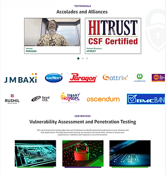
SOCIAL PROOF
-
Added client logos in a horizontal scroll for social proof and easy glance at their accolades and achievements with big companies
-
Introduced an interactive slider with navigation dots to browse testimonials
-
Transitioned from generic security imagery to specific technical representations of penetration testing environments
-
Used a clean white background with focused content areas
UNDERSTANDING THE USERS
Understand
Understand client requirements and goals
Research
Conduct market research, user interviews, brand visuals and competitor analysis
Analysis
Analyse and synthesise data, affinity mapping, personas, journey maps, and user flows
Structure information architecture, style guides, lo fidelity and hi fidelity prototypes
Design
Conduct usability testing, refine, iterate and prepare for developer handoff
Deliver
To develop a solution that genuinely addressed the needs of security professionals, I conducted comprehensive user research focused on understanding their workflows, pain points, and expectations.
I interviewed 8 cybersecurity specialists across different roles—including Security Analysts, IT Managers, and CISOs—to gather diverse perspectives.
USER RESEARCH
66%
Users needed to read service descriptions multiple times and seek additional clarification
73%
Users abandoned tasks that required navigating more than two levels deep in the menu structure
These interviews revealed critical insights about how professionals interact with security platforms during high-pressure situations, how they prioritize information, and what features they consider essential versus excessive.
The above survey results helped us understand broad user trends, simultaneously, user interviews allowed us to dig deeper into the personal experiences, emotions, and frustrations that users faced during their car rental process. The diversity in data was essential to ensure that our insights reflected the needs of different user types—whether budget-conscious locals or luxury-oriented tourists.
BRANDING RESEARCH
The first part of the project consisted of creating a brand identity for the company. Since it is in the cybersecurity domain space, elements related to security, tech, network, protection were brainstormed upon to sketch initial logo ideas that would give a unique edge to the brand.

This was followed by several iterations of colour and logo designs and character/element positions. The iterations were presented to the CEOs to understand their perspective on the same.


After several discussions and iterations, we came up with this brand guideline to have a consistency over all the mobile app, website and social media posts.
THE LOGO: This logo design conveys ideas of protection, access control, and comprehensive security services. It's a clean, modern look that would be appropriate for a technology-focused security company. The simplicity of the design makes is easily recognisable and scalable.
The "S" stands for "Securis"
The padlock represents security and protection
The shield shape formed by the "S" and padlock reinforces the idea of defense and safeguarding
The keyhole in the shield implies access control and the ability to unlock secure system
THE COLOUR SCHEME: The colour green symbolises safety and 'go' in security contexts, the colour grey conveys professionalism and stability, and the colour purple symbolises sophistication and high-level expertise
VISUAL STYLE GUIDE


LO FIDELITY WIREFRAMES
I began the redesign process by creating low-fidelity wireframes to explore various structural solutions to the identified user pain points. These wireframes focused on reorganising information architecture and establishing clear visual hierarchies without the distraction of visual design elements. I tested multiple navigation patterns, content groupings, and page layouts with 6 security professionals to validate that the fundamental structure addressed their workflow needs.


It was important to understand how the audience navigated through the website. Therefore, certain scenario-specific tasks were given to 3-4 participants to observe their responses to the current flow of information. Overall, the response was positive and well received by the users, however, there were certain loopholes to fix as well.
1. Need to incorporate more plain language or providing easy-to-understand explanations for complex terms throughout the website.
2. Support options, such as live chat or FAQs, were difficult to find, particularly for first-time visitors seeking help with cybersecurity issues.
HI-FIDELITY PROTOTYPE
Currently, these results and feedback are been worked upon and implemented for the website v2 launch. I am working on the other breakpoints (tablet, phone screens) to make the website responsive.
LEARNINGS
• Trust is a fundamental component in the cybersecurity industry. Designing clear, bold calls to action (CTAs) like “Get Protected,” “Request a Demo,” or “Download Report” with security reassurances helped drive conversions and helped in building credibility.
• Especially in the cybersecurity domain, I learned the importance of gathering feedback from both technical and non-technical users to iterate on designs. Continuous testing of CTAs, form designs, and user flow improvements allowed for optimising the website for better performance and user engagement.
